Accessible camera
Taking pictures when you can’t see
Achieved outcomes
- Released an improved SDK experience that allowed visually impaired users to complete our document capture step independently.
- This was key to unblocking a major customer and allowing them to roll out their app with our updated SDK experience.
- We accomplished this in 6 weeks, across 3 timezones and with zero prior experience building an accessible mobile camera app.
The problem
Onfido is an online identity verification service that helps businesses onboard customers (e.g. when setting up a bank account). We would get them to take a live picture of their photo ID along with a selfie at signup.
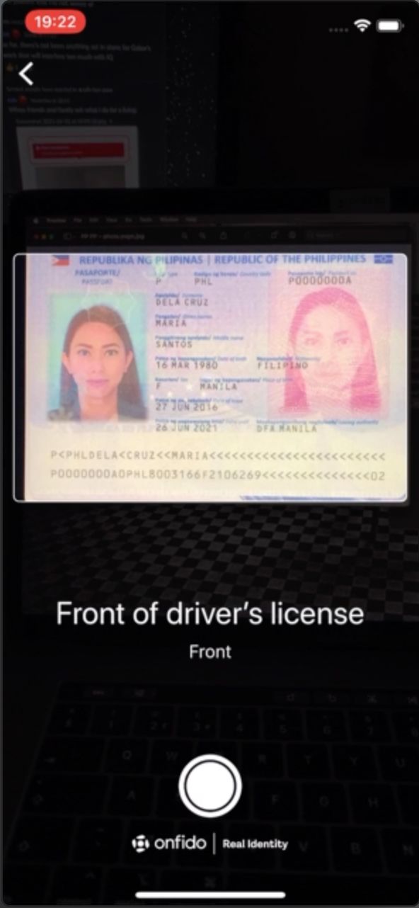
A key step in our flow uses your mobile phone to manually take a picture of your photo ID. We knew from anecdotal client feedback and accessibility audits that this step caused the most friction for our visually impaired users.
Although our existing doc capture experience complied with WCAG accessibility guidelines, we realised that visually impaired users struggled to complete this step independently as they’d often need a sighted person to ensure that the photograph was not blurred or cropped.
Pain points to solve 💢
- The screen reader’s audio feedback was too generic and the language was skewed towards sighted users (e.g. 🔊*"View from camera, place your document within the frame"*).
- Alerts were announced to provide live feedback (e.g. if glare was detected) – but the constant alerts would often interrupt visually-impaired users who were already struggling with lining up their document within the camera frame.
- Even without distractions, just keeping the camera still and in the right position required a level of dexterity which even our sighted users weren’t always able to achieve.
Fixing these accessibility issues was absolutely crucial for an upcoming rollout with a major client of ours, who had a visually-impaired employee demonstrate that the current SDK experience was impossible to get through without assistance.
Develop a document capture experience that allowed visually impaired users to take clear and uncropped photos without extra assistance.
Proposed improvements
- Detect the document’s position in real time using built-in tech on iOS and Android phones
- Provide users with live screen reader guidance on how to move their phone
- Automatically take a picture when we think the image looks good enough
Design process
Since we had no prior experience building accessible mobile camera apps, I tested out various camera and image scanning apps – then compiled some good examples with accessible patterns we could learn from.
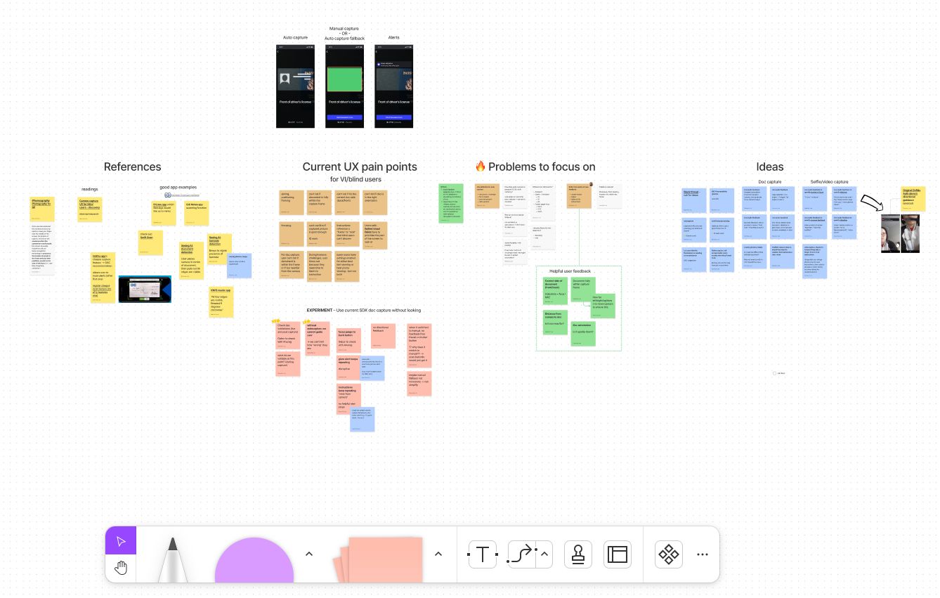
Async collaboration on FigJam was especially effective for working across timezones (me in the UK and our iOS developer in Indonesia)
We also did our own internal testing by getting the team to use our app to try and take a picture of a document with their eyes closed, which helped build empathy with our users and pinpoint specifics areas that we needed to address.
We then brainstormed ideas and picked a few to start exploring the technical implementation as well as the ideal user experience.
Taking our learnings, we began experimenting with how we might leverage the in-built camera technology of iPhones and Android devices to help detect how a document was positioned relative to the camera frame.
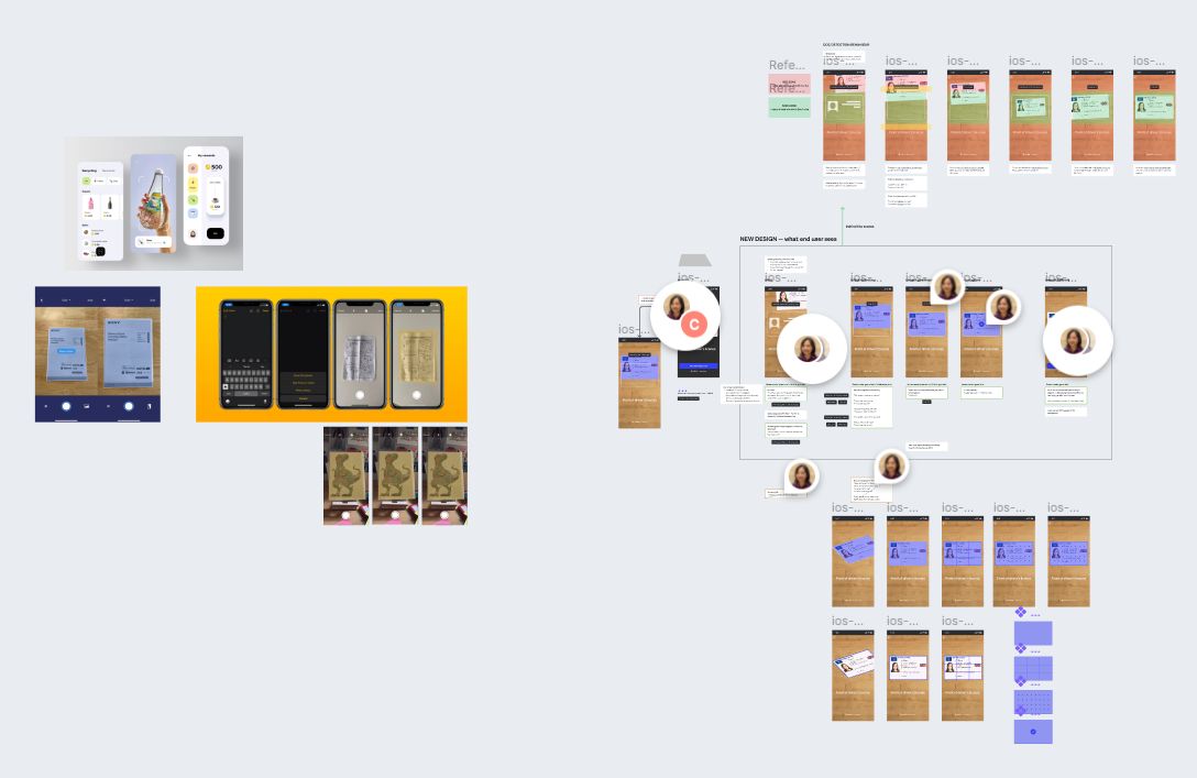
Cross-referencing accessible camera capture behaviour with our proposed new experience.
Trying to take a picture while holding the document would make it even harder (e.g. jittery hands, needing to position two items instead of one) – so we instead chose to optimise the experience for taking a picture of a document that’s placed on a flat surface.
To start validating our ideas as soon as possible, we worked on a quick proof of concept that we could get into the hands of stakeholders and the wider team for testing and early feedback. Although I was uncomfortable with not having a single visually impaired user involved early on, we were constrained by time and had to make do.
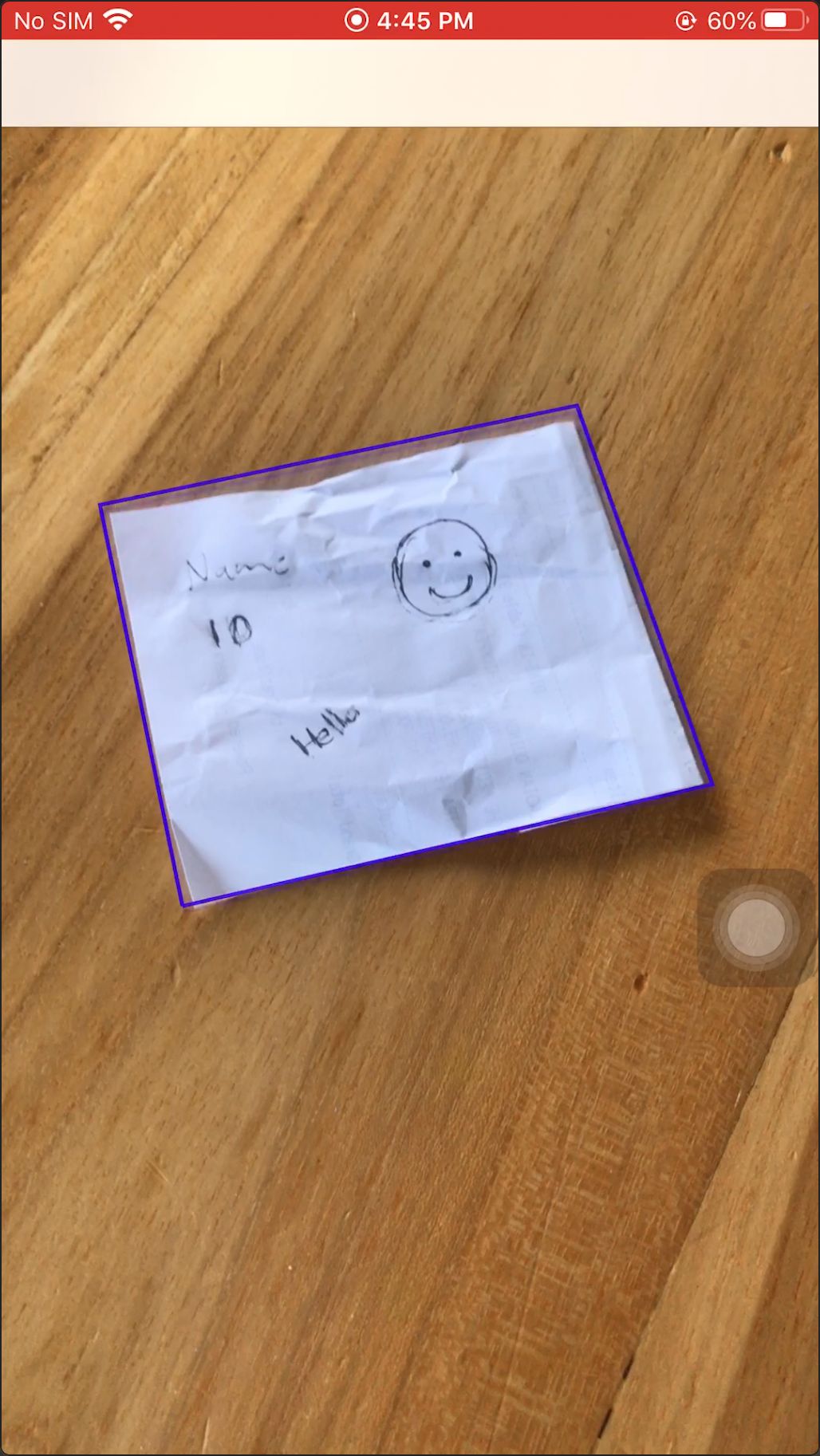
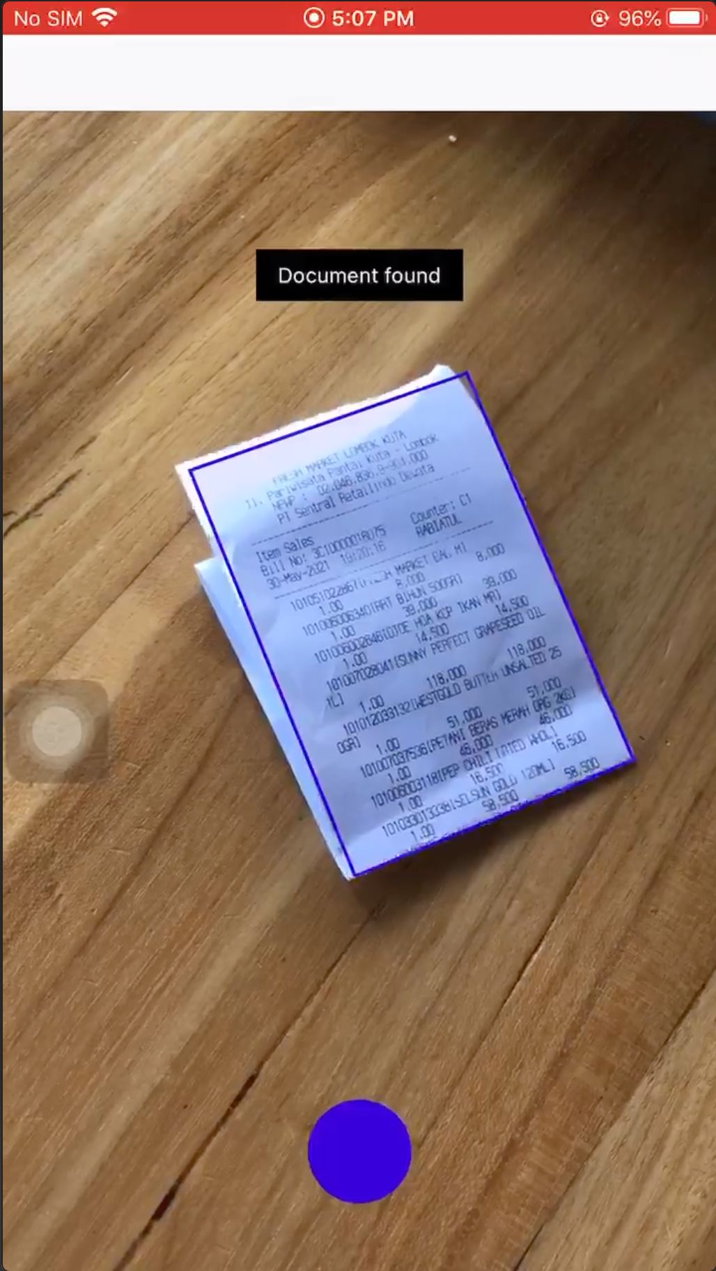
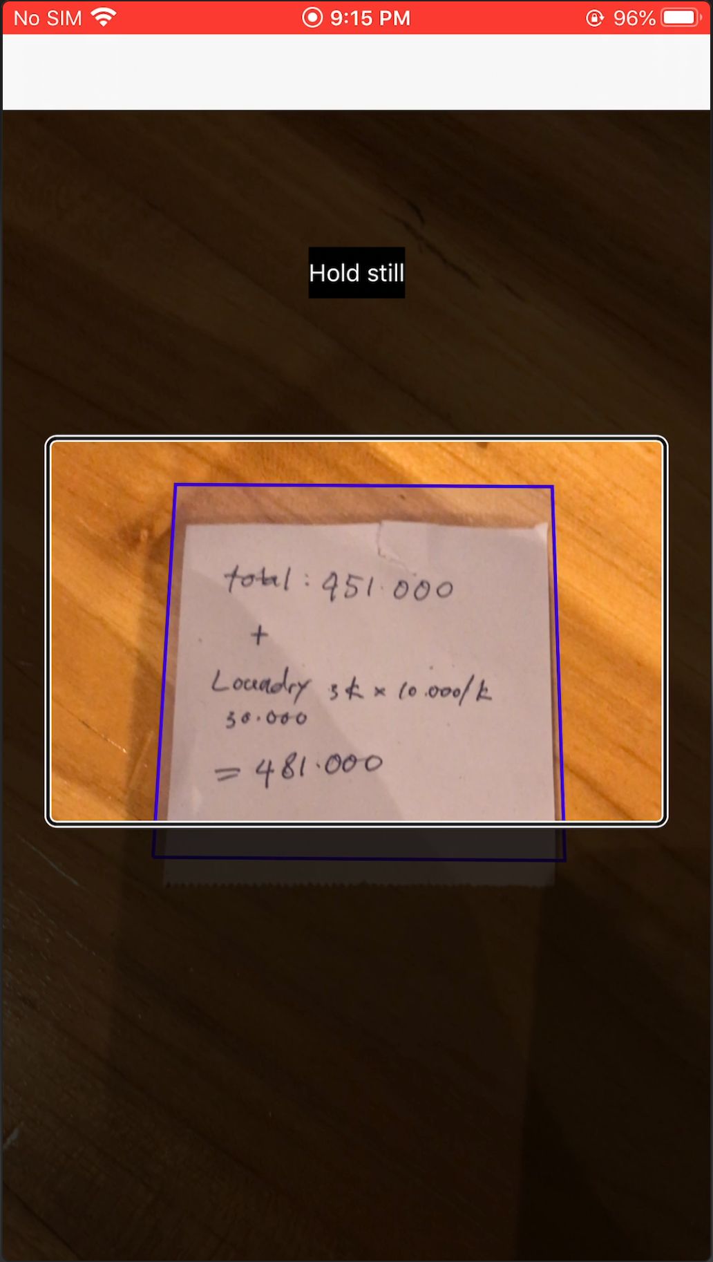
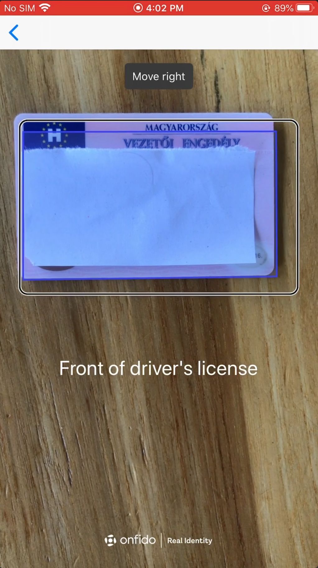
During testing, the engineers added a rectangle overlay to help visualise the real-time document detection behaviour. However, as we repeatedly tested, we realised that the overlay would be helpful visual feedback for sighted users as well so we decided to include it in our final experience.
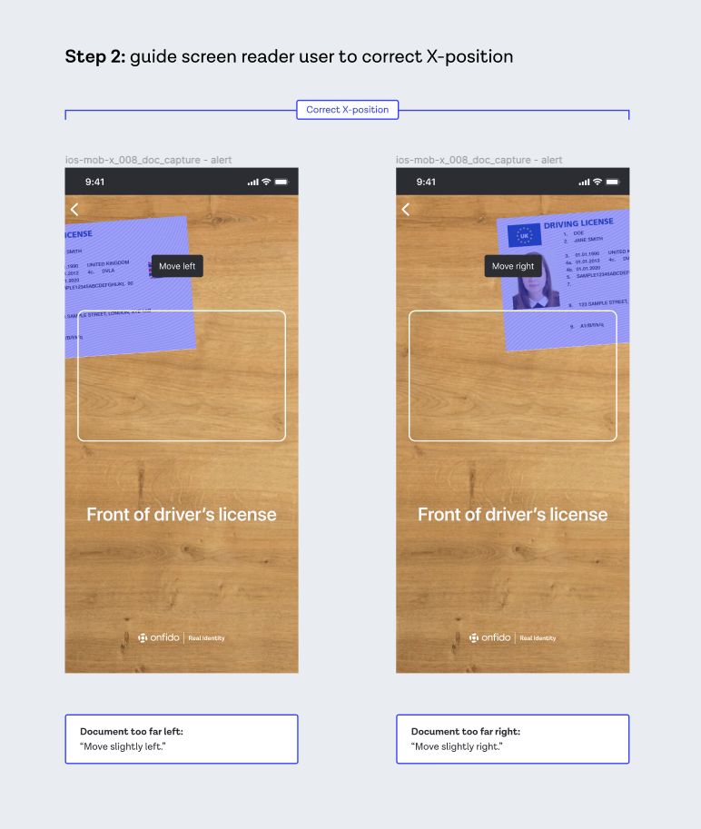
Incorporating the testing overlay in the final UI to make it more accessible for sighted users as well
We then made a company-wide call for anyone with an iPhone to take our proof of concept for a spin and give us their initial thoughts and feedback on the UX.
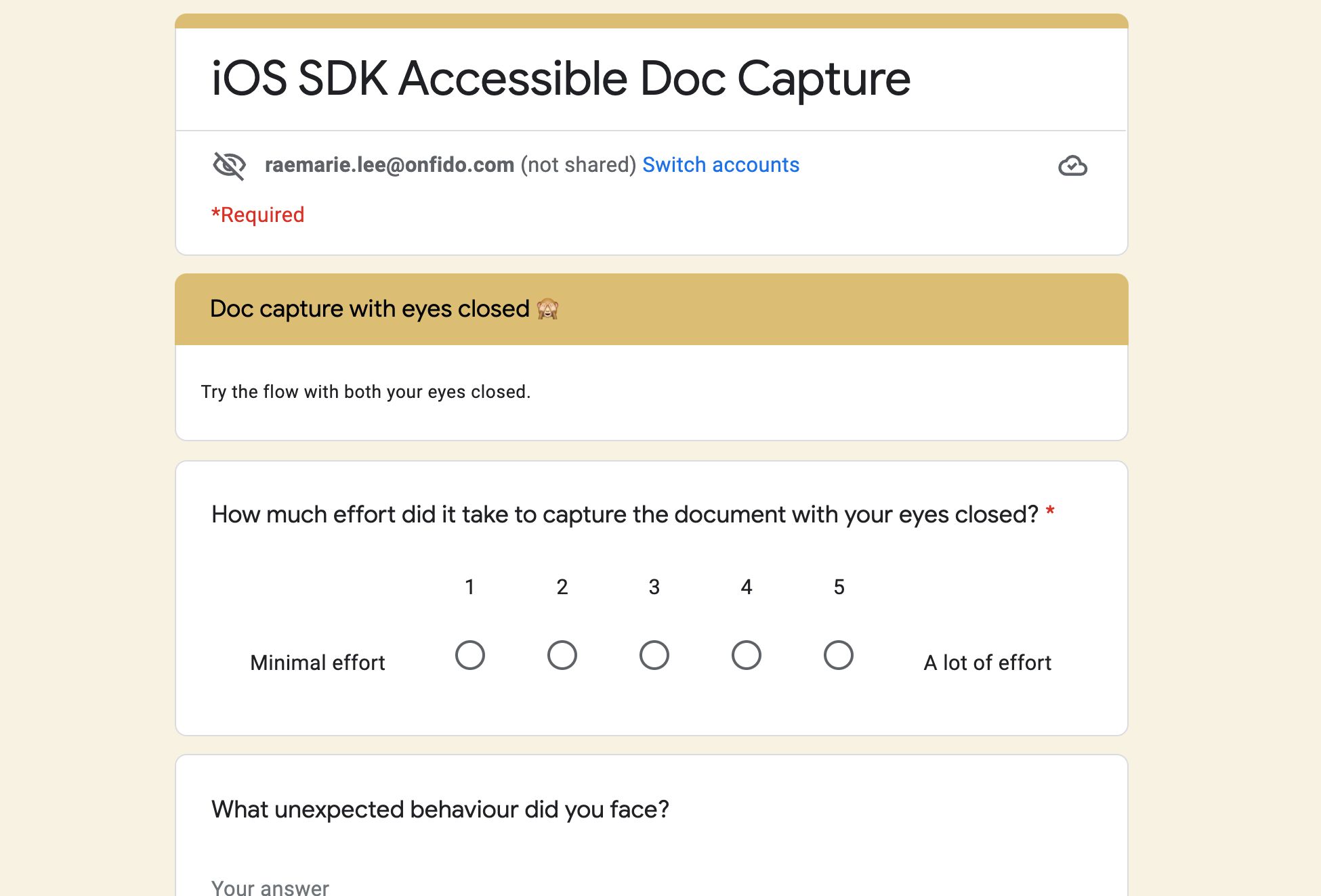
A company-wide survey we sent that quickly gathered feedback across all areas of the business (e.g. sales, engineering, business ops, design, etc.)
Since we needed to learn quickly, we did a survey that was quick to launch and easy to complete so we were able to gather a lot of responses in a short time. We asked them to have their eyes closed as they tried to take a picture of a photo ID with our prototype. For those who expressed interest, we conducted followup interviews so we could dig deeper into their feedback.
Given that most of our internal testers were not seasoned users of assistive technology (such as screen readers), we took that into account when deciding which pieces of feedback and suggestions to take on board.
💡 Feedback #1 – the instructions were too brief
Because the visual instructions were designed for sighted users, we deliberately kept the text short to make them easier to scan. A sighted user would then likely glean additional context through visual cues (e.g. a card outline implies that the document should fit within it).
However, visually impaired users would need a lot more detailed audio guidance – so I reworked the screen reader wording to make sure that there was context for visually impaired users to understand what was happening on the screen and exactly what they needed to do.
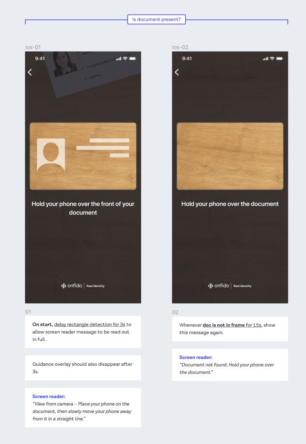
💡 Feedback #2 – relying on audio feedback made it difficult to react quickly
Some of our internal testers found themselves stuck in a loop of errors as they moved so quickly that they went past the spot when they were meant to keep still (i.e. the camera was at the optimal position and distance). So we added haptic feedback at the most important moments, such as when the document was at the correct distance away from the camera.
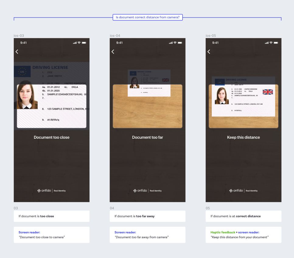
What we delivered
In the end, we delivered all the key improvements that we proposed – and we accomplished this within 6 weeks, across 3 timezones and with zero prior experience building an accessible mobile camera app.
The 3 key improvements
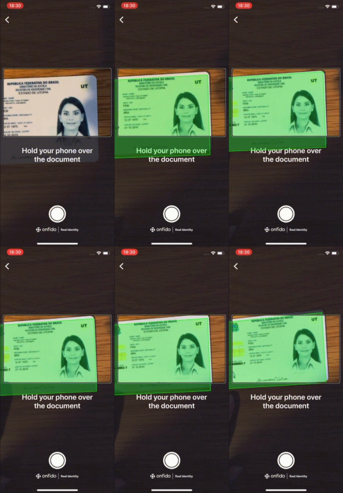
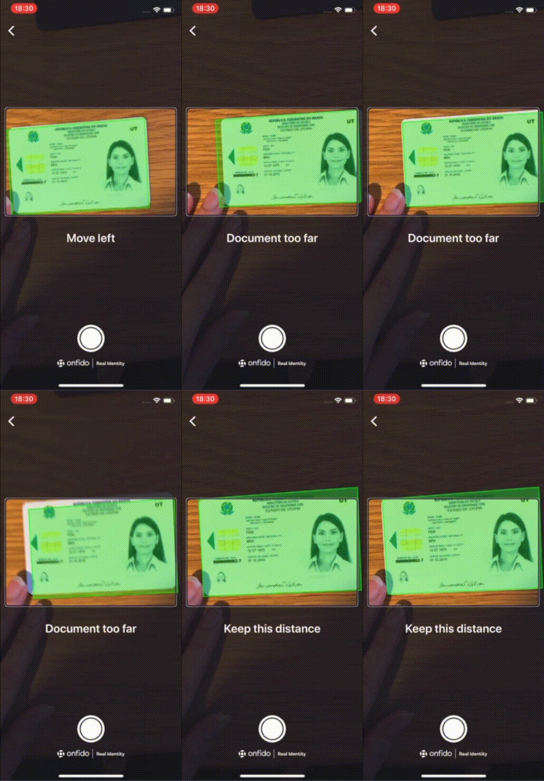
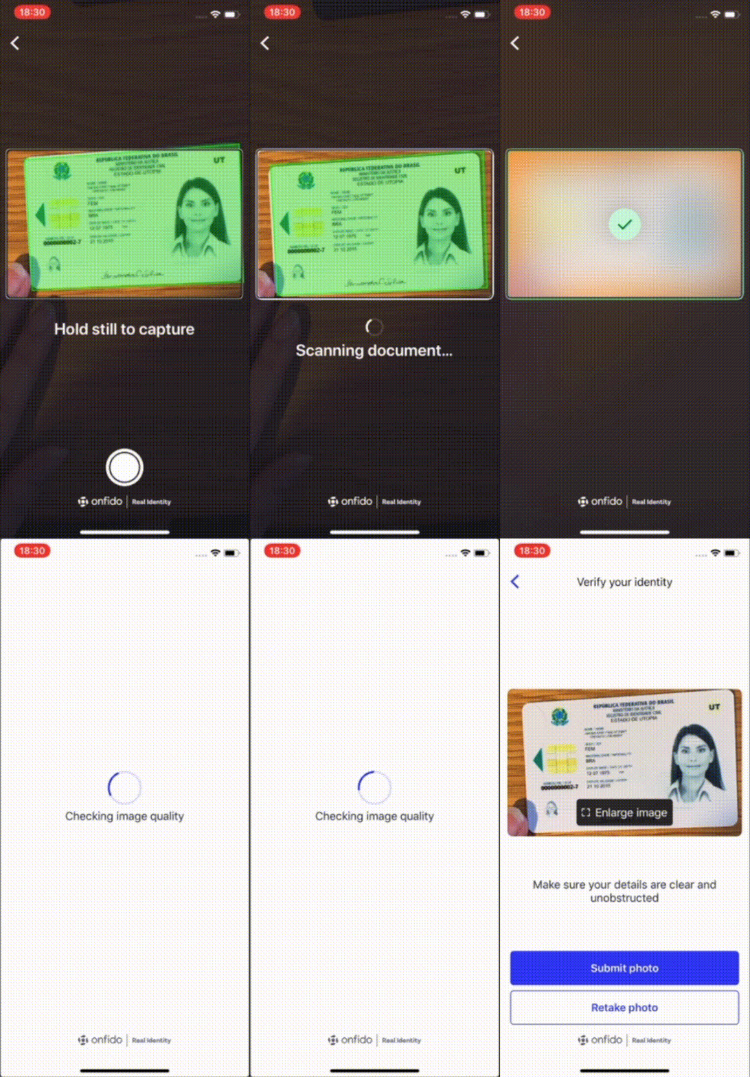
 ✅ Detect the document’s position in real time
 ✅ Provide live, detailed screen reader guidance
 ✅ Automatically take the picture when it’s good
Watch the full experience 👇
The impact
We received a great review from accessibility experts at the Digital Accessibility Centre (DAC) when we asked for their feedback. Also, the client who originally requested these improvements was very pleased with what we'd built and signed off on rolling out their app with our updated SDK experience.
All in all, this project also left a profound impact on me as I had to move quickly while operating with a lot of uncertainty – which has helped me mature as a designer.
The team and I were incredibly proud of what we achieved and I consider it one of the most meaningful projects I’ve ever had the privilege of working on. 💛