Blook app
Overcoming reader inertia through play
I designed this mobile app concept to help readers discover books in a fun, nostalgic way. This was my solo final project for my graphic design masters at Kingston School of Art.

Achieved outcomes
- I created a high-fidelity prototype that demonstrated what a potential experience for book discovery and play could look like.
- This project won me a work placement with Fintech company Onfido – where I began my product design career.
Context
- Throughout my course and prior to this, I had focussed more on traditional graphic design forms – from poster printing to letterpress and bookbinding.
- I decided to pivot to digital design for my final project as this would give me the opportunity to experiment with a new medium and broaden my design skills.
Problem
- During the initial literary research for this project, I identified an interesting design problem to tackle – avid readers who want to read but find it hard to find the time or space to do so.
- I learned that this “reader inertia” is likely a result of how quickly technology has evolved in recent decades – which has caused a shift in reading behaviour towards scanning and skimming.
- How might we design digital platforms that encourage busy readers to read more?
- How might the online user experience tie-in with the offline experience of reading?
- I also scoped my target audience towards millenials (adults aged 23 – 38) who enjoy reading for leisure, whether avidly or casually – they're likely to have grown up with the internet but also experienced a childhood without it.
Project goals
- Identify what readers enjoy and want from their reading experience.
- Find ways to incorporate offline reading experience into online realm.
- Design a visually engaging platform that is easy to navigate and encourages users to read more often.
Ideas
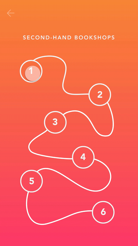
💡 Discovery by play
I wanted to tap into and engage with our innate sense of curiosity through the games I designed for this app.
💡 Microinteractions to delight
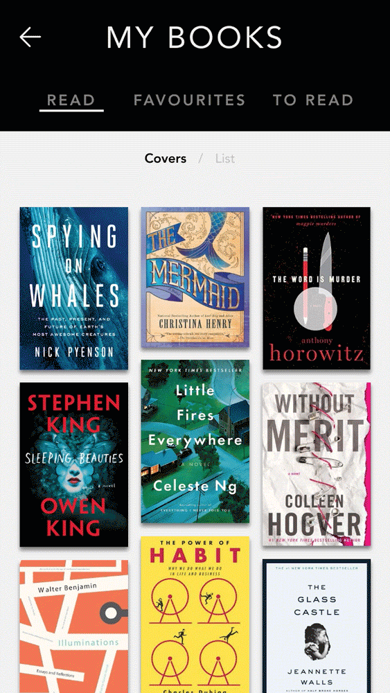
For the bookmarking feature, to inject an air of nostalgia for reading physical books, I used a dog ear fold to indicate that a book had been saved to a user’s reading list.

When designing buttons for the search page, I accidentally overlaid a circle in multiply mode – the result reminded me of bright search lights, so I decided to keep this happy accident as visual feedback after a user selects a genre.

Other ideas I wanted to explore
- I originally planned to include detailed statistics of what users had read. However, due to time constraints, I was unable to develop this secondary feature any further.
- Another aspect to develop with the app might be to help readers enjoy a distraction-free environment while reading. A ‘Reading Mode’ could potentially be added to the app that would turn off all non-essential notifications when engaged.
Process
Being new to the field, I sought guidance from experts and adopted IDEO's three phases of human-centred design – inspiration, ideation and implementation.

I started by collecting as much information as I could from primary and secondary sources.
- To get a deeper understanding of my target audience, I conducted nine in-depth interviews with both casual and avid readers.
- I also conducted field studies by visiting bookshops, libraries, museums and book fairs in the UK, Romania, Belgium and the Netherlands to really immerse myself in environments where readers gather.
- As a beginner to UX and UI design, I also attended workshops by the School of UX and Red Academy which had exercises that helped me understand the theories.

I then adopted various idea generation and prioritisation techniques.
- Using exercises like Crazy 8s, I tried to brainstorm ideas without limiting myself too much.


- After that, I prioritised these ideas with a How Now Wow matrix – so I knew which ones to continue developing and testing.

- Pulling these ideas together, I worked on wireframes that helped me to plan how I built my prototypes, which I kept iterating as I continued to gather feedback and advice along the way.

- I also consulted industry experts to gauge the feasibility of my design product in a commercial environment.
Finally, after iterating my designs from the feedback I was getting, I presented my final high-fidelity prototype for the final critique session for my course.

Conclusion
- This was my early foray into product design – I was excited and wanted to dive into everything! Instead, given I was often short on time, I learned to be more intentional and only focus on the appropriate research for the specific problem I needed to solve.
- The creative work I produced on this course has helped me to gain confidence in my design skills as I have learned to work more efficiently and without fear of failure.
- Instead of discouraging me, my failed experiments have only helped to improve my judgement as a professional designer and encouraged me to experiment even more.